How to Choose Colors for a Balloon Garland
Nadezhda Tsvetkova · Eleya Decor ·
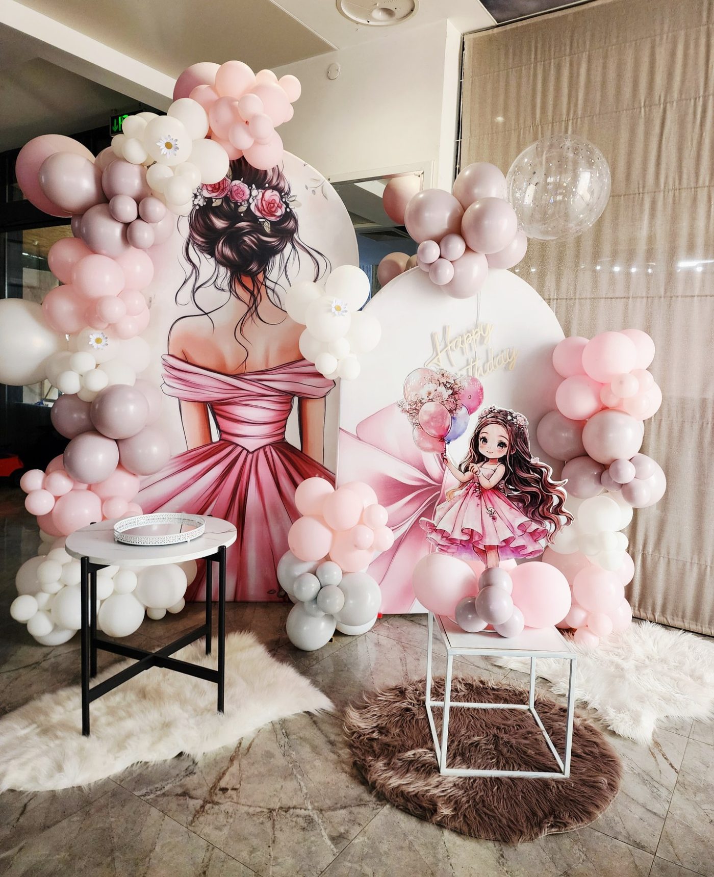
Creating a beautiful balloon garland is a little like creating a beautiful interior — it isn't enough to put lots of pretty things in one place. They have to "talk" to each other.
And that's exactly where the big challenge comes in — color.
Sometimes choosing feels like a real puzzle. There are so many shades, and once you start combining them, "pink" suddenly isn't just pink anymore.
Whether you're planning a birthday, a baptism, a wedding or a corporate event, a well-chosen palette is what turns an ordinary bunch of balloons into a finished, eye-catching design.
So today I want to show you how I approach color and share a few small tricks I use in my work.
How I start: one main color + shades + an accent
When a client tells me the general idea for the event, I usually pick one main color first and build the whole palette around it.
Then I add a few of its close shades, one contrasting color for character and, when the design allows it, a little metallic shine.
It's one of my favorite ways to create depth and a finished feel without the design becoming too busy.
For example: picture an elegant garden party with a natural, soft, slightly romantic mood. I'd start with a garden green — eucalyptus — and build the palette like this:
1. Main colors
I choose 2–3 close shades from one color family — for example eucalyptus, sage and a little sand white for more light and softness.
2. A contrasting accent
Then I add a touch of color that "wakes up" the design — a warm dusty pink or a soft apricot.
It doesn't need to be much. In my experience, a little contrast often makes the biggest difference.
3. A little shine
If the event allows it, I add a few metallic balloons — chrome gold or a gold metallic.
They catch the light and add that small wow effect, especially outdoors or with evening lighting.
The result is a garland that doesn't look like a collection of different balloons, but like one whole design — with depth, movement and shades that flow naturally into each other.
But sometimes monochrome isn't the right choice
Not every design needs soft blends and a calm palette.
For kids' parties, for example, I often go the opposite way — more energy, contrast and fun.
Picture an "Under the Sea" party. Here I'd go for a bolder combination:
- Base: deep ocean blue (navy) and bright turquoise;
- Accents: coral and sunny yellow;
- Clear balloons: crystal clear, with tiny balloons inside for an air-bubble effect.
In this case I wouldn't look for a smooth blend, but for movement and mood.
And that's something I always keep in mind: there's no single "right" color scheme for every design. For me, colors have to fit the event, the space and the feeling I want to create.
An example from my work: a soft, romantic birthday palette
For this birthday I started from the watercolor illustrations on the arches — the girl in the pink dress set the whole mood. So I chose powder pink as the main color, dusty rose and lavender gray for depth, and plenty of milky white, which "opens up" the design and keeps it light.
Instead of metallic shine I used pearl balloons and a clear balloon with pink confetti — they bring light without competing with the soft tones. Fluffy rugs and satin textures finished the soft, cozy feel.
The "Romantic Birthday" palette:
- Powder pink
- Dusty rose
- Lavender gray
- Greige
- Milky white
- Pearl accents
How I choose colors before I blow up the first balloon
This is one of my favorite parts of the process. Before I start inflating balloon after balloon, I like to see the whole picture first.
You don't need to be a graphic designer or use professional software. I use a few very handy tools that help me visualize an idea quickly:
- Canva — my favorite for quick mood boards. When I'm planning a design, I upload photos of the venue, the invitation, fabrics, flowers or other details and build the palette around them.
- Coolors.co — a very easy way to experiment with color combinations. It's especially useful when I already have one favorite color and I'm looking for what goes with it.
- Adobe Color — great when I want to play with the color wheel and different harmonies — analogous, triadic, complementary and so on.
- Pinterest — and of course, the classic. Sometimes I just need to see a combination in a real design to know whether it "speaks" to me. Search for something like "eucalyptus and dusty pink balloon garland" and you'll find endless ideas.
Have a photo of a garland you love?
Upload it to Eleira Lens — you'll see the balloon colors by name, an approximate balloon count and a price estimate. Free.
Try Eleira LensMy 5 small rules for beautiful color balance
1. Start with the 60–30–10 rule
You don't have to follow it to the last balloon, but I use it as a great starting point:
- 60% — main color
- 30% — secondary or contrasting color
- 10% — an accent, metallic or another color that draws the eye
That way the design gets balance, without all the colors fighting for attention.
2. Always think about the space and the light
I've learned that the same color can look completely different in daylight, indoors, or under warm evening lighting.
Dark colors visually "weigh" more, while light and pastel shades bring air and lightness.
3. Don't underestimate double-stuffing
This is one of my favorite ways to get a more special shade.
Putting one balloon inside another lets me create colors I could hardly get with a single balloon. For example, a dark balloon inside a light one can give a beautiful, rich, deep shade.
And yes — sometimes this little trick is exactly the difference between "nice pink" and "What is this amazing color?!"
4. Mix textures and finishes
When I work on a design, I love combining matte latex, chrome, metallic and clear balloons. It can make even a fairly small palette much richer and more interesting.
You don't need 10 different colors for a complex look. Sometimes three well-chosen colors + different textures are more than enough.
5. Test on site
This one is especially important.
In my experience, balloons can visually change their shade once inflated, and the light in a particular space makes a huge difference too.
So when color really matters for the overall look, I always recommend blowing up at least one test balloon of each color and looking at it exactly where the décor will be.
And one small truth from a decorator's kitchen…
Do you know what's sometimes the hardest part of working with color?
It isn't choosing the palette. It isn't inflating the hundredth balloon. It isn't even placing the last tiny balloon in exactly the right spot.
The hard part is explaining to your family that "salmon," "peach" and "coral" are three completely different colors…
…and that a white balloon actually comes in at least seven shades. 😂
If you're a decorator, you're probably smiling already. And if you're not — now you know a little professional secret. 🤍
Frequently asked questions
How many colors should a balloon garland have?
Usually 3 to 5: one main color with 1–2 close shades, one contrasting accent and, if it suits the event, a touch of metallic. More colors can easily make a garland look busy — unless that cheerful effect is exactly what you want, for a kids' party for example.
Which balloon garland colors are on trend?
Soft, "dusty" tones — eucalyptus and sage, powder pink, dusty rose, sand and cream — with matte latex and a little chrome or gold. Bold contrasts are still the favorite for kids' parties.
How can I tell if my colors go together?
Make a quick mood board in Canva or Coolors, follow the 60–30–10 rule and, if the color really matters, blow up one test balloon of each color right where the décor will be — in that room's light.
Quote this kind of garland in Eleira Studio — from a photo, in minutes.
Eleira Studio
Balloon decorator at Eleya Decor (Bulgaria), interior designer and founder of Eleira. She writes about color, garlands and everything she has learned working with balloons.
This guide is also available in Bulgarian.